Fairfield Inn & Suites Towanda Wysox
1 night
Rooms and Guests
1 room, 2 adults, 0 children
All Properties in Towanda
Fairfield Inn & Suites Towanda Wysox
1248 Golden Mile Rd, Towanda, Pennsylvania, 18848
Show on Map
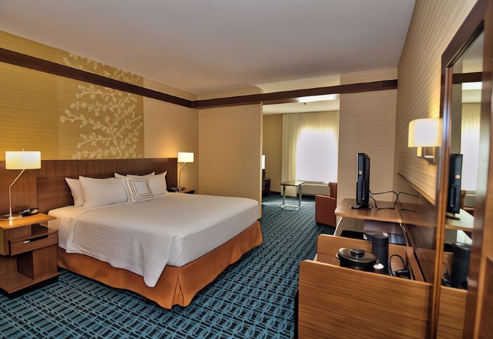
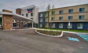
Find yourself amidst the beauty of the Endless Mountains Region of PA while staying at the Fairfield Inn & Suites Towanda Wysox. Located in Northeast Pennsylvania along historic Route 6 and a short drive away from the New York border, our property features all the comforts of home including complimentary hot breakfast, free Wi-Fi, indoor pool and a fitness center. Our comfortable and spacious guest room boast a flat-screen HDTV, microwave, mini refrigerator, coffee maker, a luxurious bedding package and separate work desk. Perfect for the business traveler, our hotel is conveniently located in the Marcellus Shale Region and nearby companies like DuPont, Cargill, Proctor & Gamble and Panda Power Plant. We look forward to seeing you at the Fairfield Inn & Suites Towanda Wysox!Show More
We Price Match


 Highlights
 Sparkling clean
 Excellent service
 Parking available
 Ideal location
 Delicious breakfast
Show More
Amenities
Public parkingFree
EV charging station
Gym
24-hour front desk
Wi-Fi in public areasFree
Conference room
Multi-function room
Business center
All Amenities
Property Description
Find yourself amidst the beauty of the Endless Mountains Region of PA while staying at the Fairfield Inn & Suites Towanda Wysox. Located in Northeast Pennsylvania along historic Route 6 and a short drive away from the New York border, our property features all the comforts of home including complimentary hot breakfast, free Wi-Fi, indoor pool and a fitness center. Our comfortable and spacious guest room boast a flat-screen HDTV, microwave, mini refrigerator, coffee maker, a luxurious bedding package and separate work desk. Perfect for the business traveler, our hotel is conveniently located in the Marcellus Shale Region and nearby companies like DuPont, Cargill, Proctor & Gamble and Panda Power Plant. We look forward to seeing you at the Fairfield Inn & Suites Towanda Wysox!
Show More
4.4/5
Very GoodCleanliness4.4
Amenities4.4
Location4.4
Service4.4
All 52 Reviews
Surroundings
Landmarks: Wysox Merchant Center
(1300 ft)
Landmarks: Anytime Fitness
(2950 ft)
Landmarks: Average Tim's Gym
(3000 ft)
Landmarks: Wysox Presbyterian Church
(1.0 mile)
Landmarks: Eastside Riverfront Park
(1.4 miles)
View on Map
Rooms
Guest Reviews
Services & Amenities
Policies

7
Room With 1 King Bed And Roll-in Shower-Mobility/Hearing Accessible
1 King bed
Non-smoking
Air conditioning
Private bathroom
Refrigerator
Towels
Check Availability

7
King Room With 1 King Bed
1 King bed
Has window
Non-smoking
Air conditioning
Private bathroom
Refrigerator
TV
Check Availability

12
One-Bedroom King Suite With Sofa Bed
1 King bed and 1 Sofa bed
Non-smoking
Air conditioning
Private bathroom
Refrigerator
TV
Check Availability

6
Room With 2 Queen Beds-Mobility/Hearing Accessible, Tub
2 Queen bed
Non-smoking
Air conditioning
Private bathroom
Refrigerator
Towels
Check Availability

7
2 Queen Beds, Guest Room, 2 Queen
2 Queen bed
Non-smoking
Air conditioning
Private bathroom
Refrigerator
Towels
Check Availability
Hide Room Types
Guest Reviews
4.4/5
Very Good
52 reviews
 Verified Reviews
- Cleanliness4.4
- Amenities4.4
- Location4.4
- Service4.4
Average for similar properties in Towanda

Gaowohengmian
August 15, 2023
The room is not bad, the breakfast is average
Original TextTranslation provided by Google

Guest User
February 3, 2025

Complementary breakfast was the best. Everything is clean and fresh. Ina does a great job with the food and always with a smile on her face. Very pleasant person to be around especially first thing in the morning. Rooms are nice, clean and quiet.

DavidandAmy
July 30, 2024

Lots of Great and one GLARING BAD!!!!!! First the great....The place was spotless and my room was super clean, even the shower. Comfortable bed and lots of breakfast offerings! Also, convenient and safe. Tina at the from desk was beyond super, with her smile and he courtesy! NOW THE BADDER THAN BAD. Front desk JOSH and manager MARQUIS are disastrous! On the phone Marquis was difficult and less than friendly when I was asking a question. In person he made me feel like a third class citizen. Upon arrival, Josh made checkin difficult and would not engage me or answer my questions. When I was finally allowed to checkin, he wrote down a number on a card and basically threw it at me, without telling me where my room was or how to get there. No courtesy or respect as a customer or a fellow human being. Fairfield Inn should look into the CUSTOMER DISSERVICE practiced at the Towanda Fairfield Inn. Perhaps a bit of customer centric behavior should be reviewed and practiced by Marquis and Josh. And just in case they do not understand what it means to be customer friendly, here it is: What is customer-centricity? Customer-centricity is a business strategy that's based on putting your customer first and at the core of your business in order to provide a positive experience and build long-term relationships.

Kathleen S
May 28, 2024

First time at this hotel, and it was a wonderful experience. First impressions are great with the landscaping and the cleanliness outside and in. The staff was very friendly and efficient. The room was clean and lovely, and the breakfast was excellent and well tended to. I would highly recommend this hotel.

Guest User
December 17, 2023

The otel and room were very clean. I was very impressed. Front desk staff was very friendly and accommodating. I would recommend staying here and I will definitely stay at another Fairfield Inn and Suites.

Guest User
October 25, 2023

Clean, well maintained, comfortable. Very nice staff. Typical Fairfield. Should have had another chair. The body wash, conditioner, and shampoo dispensers were in nearly identically labeled dispensers. The contents were identified in nearly invisible, tiny, low contrast fonts in a color combination that only some weeny-brained, non-traveling, inexperienced, color-blind, non-designer could think was desirable. The brand name was the only thing that was easily read. Apparently the contents didn’t matter. If someone had just awakened and would normally wear glasses, they wouldn’t be able to read the contents. Just another ******* piece of design over function. Graphics are forms of communication. This piece of eye pain doesn’t do that. Those products are exclusive to Marriott, so fortunately they don’t have fight for shelf space and brand identification. Otherwise, their sales probably would not keep them on the shelves for long. So, why not just keep it user friendly since the label really has little, if any, function other than identifying the contents. So just tell the user what is inside and de-emphasize the brand I.D. Anyone wanting more of the product could pursue the brand as they choose. And as an exclusive Marriott product, with probably near negligible retail sales compared. I would doubt that product line generates much, if any, meaningful profit. At least the shower had decent water pressure.

Guest User
September 8, 2023

I am a frequent guest so I have the luxury of getting to know the staff. The front desk, whether manned by Rebecca, Cassie, or Alyssa always greets me as a friend and has my room ready. Breakfast manager, Bobbie Jo works tirelessly to supply a great meal. Firecrackers Sara and Nicole are the heartbeat of a competent housekeeping staff and Mary M works tirelessly too. Tina runs night shift and is a wonderful personality to greet me early in the morning. Everyone surprised me with balloons, a banner, and cupcakes, along with a personally signed card for my birthday! The hotel is more of a work destination, but all these gals make it feel like home!

Guest User
July 17, 2023

Our stay at the Fairfield Inn and Suites in Towanda was delightful. The hotel was clean and comfortable. The breakfast was good. All of the staff were very friendly and helpful. Rebecca at the front desk went out of her way to assist us. We will certainly stay there again if we have the opportunity.

Guest User
March 6, 2023

After a long day, I very much appreciated a warm, personal welcome from Cassie, who also made sure the right credit card was on file for future stays. Nicole had the extras I requested in my clean comfortable room.
Services & Amenities
Most Popular Amenities
Public parking
Free
EV charging station
Gym
24-hour front desk
Wi-Fi in public areas
Free
Conference room
Additional charge
Multi-function room
Business center
Fax/copying service
Additional charge

Gym

Conference room
More Amenities
Internet
Wi-Fi in public areas
Free
Indoor swimming pool
Heated pool
Parking
Public (not only for guests) is available On-site parking. Reservation not needed.
Public parking
Free
Car charging facilities
Front Desk Services
Safe at front desk
24-hour front desk
Express check-in and check-out
Languages Spoken
English
Food & Drink
Lobby bar
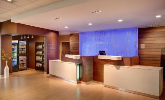
Convenience store/kiosk
Health & Wellness
Gym
Public Areas
BBQ
ATM
Elevator
No smoking in public areas
Vending machines
Cleaning Services
Laundry service (on-site)
Additional charge
Dry cleaning
Clothes dryer
Business Services
Conference room
Additional charge
Business center
Fax/copying service
Additional charge
Wedding service
Multi-function room
Accessibility
Assistive listening devices
Braille signs
Pool ramp available
Stair-free main entrance
Visual alarm devices in hallways
Property Policies
Check-in and Check-out Times
Check-in: After 15:00
Check-out: Before 12:00
Front desk hours: 24/7
Child Policies
Children of all ages are welcome at this property.
Additional fees may be charged for children using existing beds. Add the number of children to get a more accurate price.
Cribs and Extra Beds
For all room types, cribs can be added, but extra beds cannot be added.
Fees for cribs are not included in the total price. For details, please contact the property.
Breakfast
TypeAmerican, Continental
StyleBuffet
| Age | Fee |
|---|---|
Adult | Free |
Additional breakfast fees are not included in the total and need to be paid at the property.
Deposit Policy
DepositDeposit required
Deposit Collection MethodsThe deposit is determined based on the duration of your stay. The charge is $20.00 per night.
Pets
Pets are not allowed
Age Requirements
The main guest checking in must be at least 21 years old.
Paying at the Hotel


- Cash
Property Description
- Opened: 2013
- Number of Rooms: 94
Find yourself amidst the beauty of the Endless Mountains Region of PA while staying at the Fairfield Inn & Suites Towanda Wysox. Located in Northeast Pennsylvania along historic Route 6 and a short drive away from the New York border, our property features all the comforts of home including complimentary hot breakfast, free Wi-Fi, indoor pool and a fitness center. Our comfortable and spacious guest room boast a flat-screen HDTV, microwave, mini refrigerator, coffee maker, a luxurious bedding package and separate work desk. Perfect for the business traveler, our hotel is conveniently located in the Marcellus Shale Region and nearby companies like DuPont, Cargill, Proctor & Gamble and Panda Power Plant. We look forward to seeing you at the Fairfield Inn & Suites Towanda Wysox!